Text Behind Image
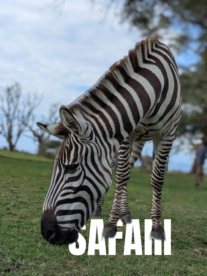
The viral effect: your subject is cut out so your text sits between them and the background, like a magazine cover. Free and 100% private.
Drop a photo
or click to browse — a clear subject (person, pet or product) works best
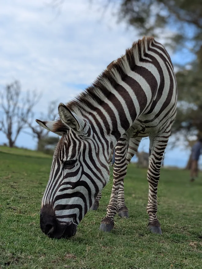
Drag on the image to move the text
The magazine-cover effect in three steps
The AI cuts out your subject automatically — no manual masking or green screen.
Type a word, pick a font, size and colour, and drag it so the subject overlaps it.
Export a full-resolution PNG or JPG with the text tucked behind your subject.
Everything runs in your browser, so your photo never leaves your device — perfect for eye-catching posts, thumbnails and posters.
The text-behind-subject effect
How the layering works
The effect is three layers. At the bottom, the original photo. In the middle, your text. On top, a cut-out of the subject with a transparent background, aligned exactly over its original position.
Because the top layer is the same subject in the same place, the text appears to pass behind them while the photo looks untouched. Everything depends on that alignment — the cut-out must sit pixel-for-pixel where it came from, which is why the effect is built from one photo rather than composited from two.
Choosing a photo that works
Not every image suits it. What you need is a clear subject with visible space around them for the text to occupy:
- A subject that does not fill the frame — head-and-shoulders or full-body with room at the sides.
- A background that is relatively plain where the text will sit, so the words stay readable.
- Good separation between subject and background, since the whole effect rests on the quality of the cut-out.
- Ideally a subject whose outline is interesting — text disappearing behind a shoulder or between an arm and the body sells the depth far better than text behind a plain silhouette.
Typography choices
Heavy, wide letterforms work best, because you want a substantial amount of text area for the subject to overlap. Thin type passes behind a subject almost invisibly and the effect is lost.
Set the text large — often larger than feels sensible, frequently spanning the full frame width. The most effective versions use one or two words at a scale that would be overwhelming if the subject were not breaking it up.
Selling the depth
Two touches make it convincing. Slightly reducing the text's opacity, or nudging its colour towards the background's, makes it read as further away rather than pasted between two layers — atmospheric perspective, the same reason distant hills look paler.
The other is checking the cut-out edge at full zoom. Since the subject is composited back onto its own photo, a halo of leftover background is subtle rather than obvious — but the eye still registers it as a slightly wrong outline, which undercuts the illusion the whole effect depends on.
Preguntas frecuentes
How does the text-behind-image effect work?
Is it free and private?
What photos work best?
Can I change the font, size, colour and position?
Más herramientas gratis y privadas
Exporta aquí y sigue editando allí — tu imagen te acompaña, sin volver a subirla.